As other have said Viro should remain with the size it has and might as well butcher the Plumbing room since no one actually uses it, been nerfed to oblivion tbh, or at least obs don’t go TG route
2 Likes
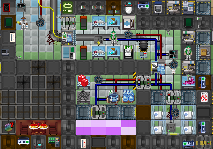
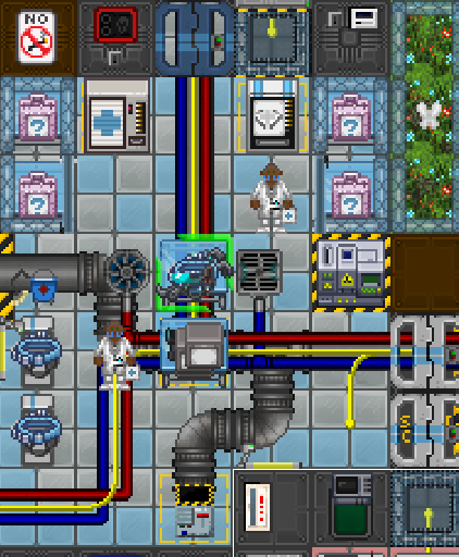
rework of the area
1 Like
looks good!
just some small stuff. I would add a viro sample fridge here, and maybe victors bed here.
Also those lights are inside the grass!
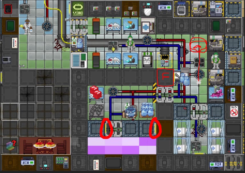
wich one?
Edit: I ended up copying the sample storage in Rad virology for the one in the entrance and the preloaded where you suggested
1 Like
2 Likes
This is really growing on me, but I have an idea may be silly. Why not make that reception area actually the sec part. To make the seccie sort of a desk boy door opener would be interesting!
1 Like
/TG/ Kinda did this but if there is no secoff (and remember, this is a lowpop map so the chances of not having a secoff in mdebay are there) then no one can man the desk. Also it puts the awkward room right there in the middle
Implying anyone ever does
2 Likes
Will you ever say something positive about anything in this thread?
1 Like
Do you want me to be another yesman, or do you want feedback? Also Im autistic and now I feel offended. Do your map by yourself then…
I have 0 yesmen, I want feedback but you don’t adress any change I make based on your suggestions and instead you choose to say the next minor thing you notice you dislike, like a bed not being in some place for example. Instead of talking about the big picture or like I said giving feedback on the changes I did based off feedback you just say “this is wrong/twhy is this like this” instead of proposing ideas or idk giving feedback about the changes I made based on your suggestions
1 Like
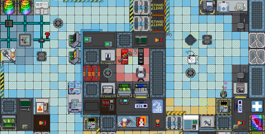
Do i have to mention the missing wall in surgery in the video sent last?
Most of my feedback were constructive so far, but im not going to be positive of a change that goes against the theme of the map.
2 Likes
Sec is well designed*, Sci is mediocrely designed, Cargo is small but totally functional for the scope of the map, the bridge could use some more signage but is well designed.
Legit most of this map, inspite of it’s small scale is pretty friggin good. the map isn’t claustrophobic due to antiquated departmental design it’s claustrophobic because the spaces within it are all so close togeather.
if we really wanted claustrophobia, put even less windows in medbay. For that real Isolated but compact feeling, the following can be done.
- the windows to the front lobby can be reduced, as can the windowed airlocks be replaced with windowless doors
- The windows separating main treatment from departmental storage and Cloning could be replaced with walls.
- remove windows looking into genetics too.
- that window into the hallway behind the chem heater? axe it. same with the one behind the disposals chute, and get rid of that hippie ass zen garden in chemistry, replaced with more grey tables, bam whole other more oppressive atmosphere.
- viro doesn’t need two windows leading to the hallway, axe em, bam, you are isolated.
the key to a claustrophobic atmosphere isn’t the layout, it’s the absence of sightlines. Surgery, inspite of it’s obviously unfinished state in the video, is a perfect example of this.
We can have a med-bay with a nice sensical layout, but without the current design practices in mapping that make them open and welcoming too.
(*personally I think SEC could be smaller, maybe I should do that…)
1 Like
Do we really need any of that, why would you want to feel isolated in a map that sees 20 people on average
I merely suggested it as a means of promoting discussion like this.
If you ask me some slightly reduced sightlines may be interesting.
Edit: yeah this is a comprise because we don’t need to sacrifice good layout in the name of promoting a specific, less important aspect.
Lets not forget that a game space should play well before looking cool or before modifying to create a more difficult environment.
Kilo med as it stands is not a very good layout.
2 Likes
Welcome to PRing. 9 out of 10 times you’re actively changing something people either A - Enjoy or B - Are indiferent to.
You’re never going to have people say yeah nice change you made. Just look at Ruko. He makes a lot of good changed and he gets shafter in the forums and discord.
Players don’t understand that without change the game stagnates.
I have no ill feelings towards kilo medbay and I agree with Shiraizawa that the map theme should be respected, but your changes have grown on me. Untill I play it and get used to it I wont know for sure if its good or bad.
3 Likes
I didn’t like some of the stuff you said cuz aesthetics but I did remove a couple windows and also I made storage more cramped and small
Yeah if you disagreed with Shiraizawa you probably weren’t gonna listen to making it feel more cramped by other means. ![]()
I’m just happy about this new layout having a better flow and use of space than Kilo currently
I took some windows out but I wasn’t going to cut the hall windows for example because it looked horrible from outside. I took both yours and Shiraizawa feedback and had it in mind while reworking the map, idk what are you saying